
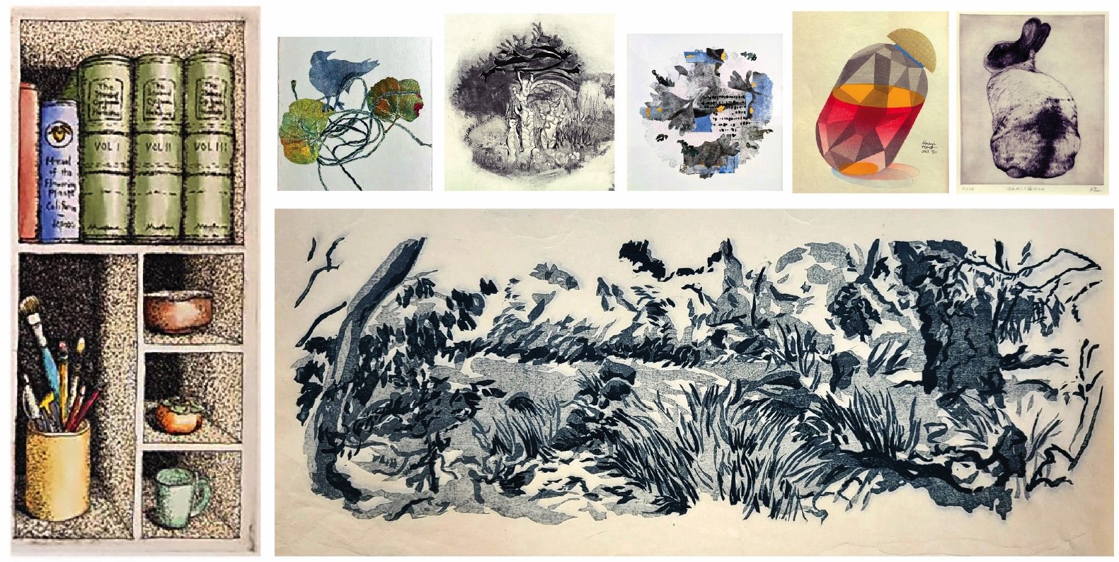
Artist Statements
Barbara Morris
All art is the result of action taken to manifest an idea. It could be something quite simple and direct, like a spontaneous gesture on a handy surface, or far more complex, a mural-sized historical painting, or a precisely rendered edition of etchings. While the tools and techniques an artist employs may vary widely, all work springs from that same basic creative impulse, and the spark of an idea that generates a course of action to bring that thought to life.
My own process is largely based in intuitive response to line and color. As a painter, I learned that craft from gifted artists who each shared their own approach and process. With basic skills like stretching and priming canvas, and fundamentals of drawing and painting techniques, over several decades I have developed my own approach to painting. With printmaking, I have been drawn to monoprint, the “painterly print” that results in a single unique image from each plate. To be more precise, I most often use a monotype technique; unlike monoprint, which includes a fixed matrix, something incised or otherwise permanently adhered to the printing plate that will affect the composition of all works which use it, a monotype offers infinite variation with each subsequent pull.
As a graduate student, I studied lithography, but that process ultimately felt a bit cumbersome, as I manipulated a litho stone of considerable size and mass. But the craftsmanship of the printmaker was firmly etched, if you will, into my brain early on. There’s a certain obsessiveness about keeping things clean, your tools, your edges, the borders of the prints. A measuring and planning aspect that requires constant diligence, and of course that underlying knowledge that whatever you compose on the plate is going to emerge from the press backwards!
As with any art or discipline, there are those who are excellent technicians, who perhaps lack the creative energy to bring the work to life, as well as those who have abundant energy and spirited ideas, but a bit thin on the discipline and control to share their vision in a compelling form. I hope to find a balance, to tap into at least a bit of the best of both worlds, and to create striking, well-made work that expresses something ineffable arising from a place deep in my heart. Once I have my basic idea in hand, often inspired by an image found in nature, or perhaps still life, and tools at the ready, I place faith in the idea that my training and experience will steer me in the right direction, to a solid composition and vibrant color combinations, to a work that will pull together in a coherent fashion, and then it’s just a matter of hoping that my muse will be with me, guiding my hand.
Cassidy Skillman
Neglected Places: Below the Offshore Rig asks us to look past the surface and recognize the system thinkers finding ways to survive capitalism’s intrusions into the ocean. Carved in reduction woodcut, the work mirrors its subject — each pass of the blade strips the block down to its core, just as the piece strips the political machinery around these reefs down to what remains underneath.
Underwater ecosystems are overtaking the legs of offshore oil rigs, forming unexpected artificial reefs. As coral populations edge toward endangerment, oil companies have leaned into this — greenwashing their failure to decommission abandoned structures as an environmental win. Their argument: rigs make valuable artificial habitats for reef growth.
Rigs-to-Reefs is the government project (under BSEE) that formalizes this logic. But the industry still comes out ahead — saving money by dodging full decommissioning and leaving infrastructure out of sight, out of mind. It’s Big Oil and government PR running alongside the same industry accelerating climate disasters through environmental neglect.
Organizations like Blue Latitudes are pushing back — working to conserve the ecosystems that have genuinely taken hold beneath these platforms by modifying structures rather than dismantling them.
Cathy Leather
Craftsmanship in my printmaking is rooted in a desire to tell a story through image. I often begin with a clearly envisioned scene, and from there consider which printmaking approach—photopolymer, drypoint, or other processes—can best bring that vision to life. In this way, intention guides technique, and craftsmanship emerges through the effort to translate an internal image into a resolved print.
Much of my work is grounded in photopolymer, where I integrate photography, digital composition, and printmaking. Drawing on decades of experience with photography and Photoshop, I construct images that can be translated into a plate capable of holding a full tonal range. This stage requires both technical understanding and careful preparation, as well as iterative testing to refine exposure, tonal separation, and printability.
In the printing process, craftsmanship is shaped through patience and repeated proofing. I create multiple artist proofs, adjusting ink, wiping, and plate tone to find the most effective way to carry the image. My approach to wiping is central: I often move ink across the plate to build atmosphere, using both broad gestures and more precise techniques—such as working with fingertips or the edge of tarlatan—to open areas of light or define forms like feathers. These decisions allow the image to breathe and take on a sense of air and presence.
What distinguishes the final work is the integration of these elements—image, tone, and surface—so that the print feels embedded rather than imposed. For me, craftsmanship is not a fixed skill but a by-product of curiosity and persistence. Long periods of experimentation, including failure, gradually become knowledge, allowing for a more confident and intuitive approach in the final print.
My most recent work, Where Water Remembers, holds the marsh as a space of layered memory. The heron—an enduring presence that predates human settlement—anchors the image, while faint traces of human history move quietly through the landscape: the Coastal Miwok, missionization, ranching, and the arrival of cattle. These histories are held within the same visual field, alongside a present-day effort to restore and return the land to ecological balance. That is the story I wished to tell through printmaking.
Christine Herman
Taking photos is a fundamental part of my practice as a printmaker, which I use to document vistas and details. It is also a way to recall my emotional responses to the raw beauty I witness. The explorative journey outdoors is as much part of the work as the resulting prints. The ever changing elements of water, wind, and flora capture my attention. Weathered wood, tidal marshlands, coastal shorelines, and redwood groves, all intrigue me and act as inspiration. When I return to my studio, I develop work that responds to the energy of a particular place, using my photographs as a jumping off point. However, I interpret these natural settings intuitively and abstractly, via feelings and memory.
My printmaking practice includes building collagraph plates using matboard as the base and drawing lines and shapes with molding paste layer by layer. I customarily print a multitude of collagraphs over time so I have a library of source prints to select from when I am collage them into compositions, merging them with monotypes that I develop in separate series. More recently I have incorporated suminagashi (floating sumi ink on water to create unique designs on mulberry paper) then printed my collagraph plates over them. This added layer of subtle swirling movement of the suminagashi furthers my ability to express emotional 'places' loosely based on the concept of landscape.
Once I have a large collection of collagraphs, monotypes, and suminagashi papers completed, I spend a lot of time meditating about how they can be 'knit' together and re-envisioned into something new. I tear, cut, shape, rearrange, and layer them until I feel they come into an altered and cohesive composition that embodies the themes I want to express: presence, absence, and transience. Through the language of marks, repetitive details, and texture, my aim is to strike a balance between color and line, space and form.
Dana Zed
I am a SF bay area artist who has been exhibiting for over 40 years. I am interested in color, pattern, metaphysics, truth and beauty.
Danguole Rita Kuolas
Craftsmanship implies competence, precision and an ongoing practice that utilizes learned skills. Printmaking in the way that I practice it, requires craftsmanship. When carving relief blocks, whether linoleum or wood, decisions need to be made that leave little room for second thoughts. Once the blade pierces the surface, there is no recourse. That said, I should also mention that I rarely work from a finished drawing that would be transferred to a block. I usually begin by looking through sketchbooks or random scraps of paper that I doodled on, grasping a wisp of an image, a delicate line, a strange juxtaposition of shapes and begin to draw on the block. Thus, I have a bare skeleton of an idea and begin to carve, with little thought as to what the finished image will be. Because I have developed the skill of carving over many, many years of practice, I am afforded the freedom to improvise and create an image spontaneously, intuitively knowing what to carve out and what to leave uncarved, balancing black and white, texture and solid mass. The result contains intricately carved lines that outline or fill in and as a result, draw out images that are there as a challenge for the viewer to behold.
Deena Haynes
What We Hold was created through a layered, hand-printed process combining monoprint, cyanotype, and touches of gold leaf on archival paper. Each layer was built in response to what had already emerged, allowing the image to evolve rather than follow a fixed outcome.
Craftsmanship in this work was rooted in attentiveness—to material, process, and timing. Monoprint introduced variation and unpredictability, while cyanotype brought sensitivity to light and chemistry. Gold leaf was applied sparingly, requiring care and restraint. Each element asked for a different kind of handling, and What We Hold developed through this ongoing exchange. The surface held a record of decisions, adjustments, and pauses, forming through accumulation—through the push and pull between intention and discovery. Craftsmanship here was not about control or perfection, but about presence, responsiveness, and deep engagement with the materials as they revealed themselves
Donna Brown
Saturday Market was inspired by the beauty I saw displayed on the cobblestone street. There were just a few bouquets of simple wildflowers in cans and glass jars sitting on a burlap bag. No was around to ask about them. I took a photo and years later began the etching using hardground and aquatint to create the key plate. I then proceeded to print the black key image on Kozo paper an edition of 15. I sanded my plate and reapplied aquatint to the areas that were to be yellow and printed this color over the key image. I then followed this process 2 additional times to add cyan and magenta colors to the print, sanding and aquatinting 2 more times. Next The chine colle technique was applied to attach the Kozo layer to BFK. The process took me some time, probably 3 months. Also, possibly because I processed two plates and created a diptych edition. It was a process that I have completed several times and enjoy the challenge. The work is pleasing to me though not as I originally envisioned but that is a part of the process. The unexpected!
Donna Westerman
Having taught printmaking at the college level for 35 years, craftsmanship has been a central part of process for me. Knowledge of color ( color theory which I also taught plays a large role in my imagery. Layering of glazes adds depth and subtlety to the colors. My use of color relates to my experience with egg tempera painting.which I also do. I work from the natural world around me with the starting point always the drawing. I was classically trained from an early age with an emphasis on drawing and line-work and in demanding techniques from earlier eras. In the end my work tends to be classic but modern; factually based but imaginatively driven.
Eileen Parent
My practice is partly inspired by patterns that I find in nature, in constructed environments, and the intuition to create a human mark. My drawings and prints are created through direct process that teeters between focus and letting go. What materializes is an internal language that is personal and individual but reflective of the organic patterns around me. Such as the bark of trees, petals accumulated in the cracks of sidewalks, broken glass, and the reflection of sunlight on water. These marks are a documentation of time, of the phenomenon of nature, and a realization of my own presence. Making a mark records my hand and is evidence of my slow and repetitive method. The marks I make relate to the size of the span of my hand, making it individual to me. Some of my larger drawings are a response to the scale of my body and my reach.
I am intrigued by nature’s code and the patterns of the natural world. Though I do not use the Fibonacci sequence in my work it is something I am reflecting on when placing my units of marks on paper. The long history of mark making is endlessly fascinating to me. Abstract and geometric marks, large and small, have been found since the emergence of the earliest Homo sapiens. Carvings on rocks, seashells and cave walls have been found throughout the world. The similarities suggest that the marks are more than just random squiggles. These facts suggest that mark-making is inborn, an evolved inclination that has been essential to our growth. Do I make these marks because I have a predisposition to do so? Or is it a reflection of the world I, see?
When creating a piece, I choose the tools that I will use by the quality of mark they produce. I work in drawing, etching, monoprinting and painting. Some of the tools I use are soft graphite, silver point, pen, paint and colored pencils. I limit my color palette to help in my decisions about the size and the direction that the marks will take. I let the marks grow slowly, evolving organically according to my gesture, ending in a field or form. I sometimes set rules for a piece. Allowing myself to stand in only one spot so that drawing grows consistent with my reach. My hope is for the viewer to see my presence, the documentation of time spent and that the piece may be reflective of the larger patterns that create our world.
Elizabeth Addison
Hills Series statement:
The Hills print series is a visual love poem to the North Berkeley Hills. Ancient oak woodlands, with coast live oak and California bay laurel, stand sentinel. The scent of California sagebrush hangs in the air, a fragrant reminder of the native shrubs that dot the landscape. Wildflowers bloom in a riot of color, with monkeyflowers, fremontias, and carpenteria adding splashes of yellow, orange, and purple. I walk the hills daily. Their moods and messages communicate something worth contemplating each day.
These hybrid prints are created with original digital imagery, monoprint, monotype, stencil, and other experimental printmaking techniques on 100% cotton rag paper. The circular prints are raised from the substrate, making them subtly dimensional.
Artist Statement:
As an ecofeminist, the natural world energizes me, and it's where my scientific curiosity and environmental concerns intersect best, exploring topics from California’s native flora and waterways to social justice and environmental equity. My current hybrid print and dimensional collage series is inspired by The Smith River, California’s last wild river. My prints and dimensional mixed-media works integrate original digital imagery inspired by my nature wanderings, monotype, and other innovative printmaking techniques. I print on 100% cotton rag paper, then cut and construct. These works are intentionally mandala-like, embodying my personal experiences and my reverence for Earth’s rivers, streams, lakes, and freshwaters—the lifeblood upon which all existence depends.
Since 2019, I've immersed myself in socially and environmentally engaged curatorial work, serving as the exhibitions chair for the Northern California Women’s Caucus for Art and, more recently, co-founder of The International Roots Art Project, a global art initiative. These experiences have been thrilling and deeply satisfying—bringing together and engaging with communities, scholars, and creatives. Together, we amplify our voices, spark action with meaningful discussion, and draw inspiration from the present moment. Art has the power to do that.
Frances Valesco
My work is a direct response to the environment, drawing inspiration from natural life forms I encounter in my surroundings or during my travels. This connection to the familiar and the natural world allows these visual marks to tell a story. My latest work is about inner voyages and the exploration of the body as it is transformed by age and illness.
Gustavo Mora Perez
In my work, I put a twist on traditional relief printmaking techniques by combining linocut and woodcut in a single image. I am attentive to every phase of the process choosing the material, drawing on the surface, carving, and printing.
When I carve the surface, I am in direct contact with the material. The experience evokes different emotions. From something flat, I discover an image. I believe the wonder inherent in the creative act is innate to the human experience. We explore our senses, scratching the surface to create images that express our unique perspectives, in my case working with different elements to create an interpretation of urban and natural landscapes.
I like having control of the carving, but I also appreciate the random surprises that arise in the creative act of printmaking, especially when working with wood. The physical effort of carving is satisfying, a transfer of energy and emotion. Each material has its own nature. I transform the materials with gouges, rollers, and either a baren or a press. The process is playful, and I feel rewarded by the direct interaction with them.
I bring a variety of intentions to the printmaking process. One is to create an image through the composition of elements and let the nature of materials appear. Experimenting with the different layers involved in a print is a magical process. My craftsmanship encompasses every phase of the process and results not only in individual images but in concepts that emerge from series of prints. Craftsmanship in printmaking reflects our soulfulness and skill as artists that we wish to share with viewers.
Hannah Skoonberg
This print was made using the traditional Japanese woodcut process. Completed while on a residency to Japan to learn the technique and craftsmanship from Japanese artists. The paper was made by me using kozo fibers at the Udatsu paper museum with the help of papermaking artisans. The image itself is based on a watercolor sketch from the San Francisco Botanical Garden and I really wanted to maintain the loose feeling of the watercolor sketch in the woodcut process.
Jerry Theobald
This print was made from a etched plate, wood was cut to mount the print on the wood.
The background was covered with heavy fabric, small pieces of wood was cut to make it 3D.
Small nails was used to mount the beads on the wood wrapped with leather. Copper was etched and cut for the corners, also two copper pieces was etched for the background sides. The wood was stained and some black paint used.
Jessica Dunne
Icelandic horses have no natural predators, but they were bred in a subpolar region. The strongest survived.
Dogs have needy eyes; they’ve evolved to look needy. Even my tortoise looks at me with expectation. But when I looked into the eyes of an Icelandic horse, I saw self-sufficiency. All they were saying to me was “I’m here.”
Jill Reich
This monoprint is based on observations of Tule elk at Point Reyes National Seashore. The background is rendered in gouache, creating an atmospheric contrast to the printed forms. I was drawn to the way the elk appeared to engage with one another—as if in quiet conversation while moving through their environment. That subtle, almost humorous sense of interaction suggested a narrative beyond the purely observational. The title reflects this impulse, hinting at the projection of human presence and meaning onto the natural world.
Jonna Kidd
I work in printmaking, painting, sculpture, and video installation and am interested in bridging boundaries between different media. The goal is to create visual representations of inner emotional states with work that provokes an immediate emotional response. To create this work, I collect photographs with a variety of interesting textures from different places and objects. Using photoshop I repurpose these textures to carefully craft a new and entirely different image. I then print the work as a screenprint.
Kathryn Greenwald
For the artwork, Sea Life Calligraphy, I painted on Plexiglass using oil-based ink to interpret the ruffle seen in the arm of a jellyfish or the movement of a squid. I printed on 30 weight gampi paper. This is the same paper that I use with low temperature encaustic. Once thoroughly dry, I layered colored sheets to express different zones of water and the rising temperatures of the sea.
For over a decade, I honed my craftsmanship as a printmaker in the print studio of Monterey Peninsula College and on the press in my own studio. I wanted to try new processes as I worked toward my own exacting standards in increasingly complex and large monotypes. In 2019 when my sister was in hospice through the early months of 2020 when she died, the studio was a refuge, a place to process loss and grief through careful application of color in multi-drop pieces that required the assistance of other class members when it was time to line up plate and paper.
Once shelter-in-place was necessary, I began to combine monotype prints with layers of encaustic to alter the space and content of the images. I wanted to express the underlying spirit and mystery of all life in the water images I was working on. Experimentation informed me about the type of gampi that worked best, how to effectively bond the layers of media and how to preserve the beautiful melted textures as they fused in combination with other colors and oil-based inks. After creating a series of images of the Carmel River near my home, I eventually created a series, River to the Sea, which led to images of the ocean.
Increasing abstraction was sparked by Into the Deep at the Monterey Bay Aquarium. I watched glowing red and violet invertebrates-- sea angels and bloody-belly comb jellies--move in the dark along with many previously unknown creatures that live far below the surface. Added to my experiences with the vibrant world seen snorkeling and walking along nearby shores, my work shifted to explore the living and threatened sea. Leaving the press behind, I made impressions of melted encaustic. The colored papers became my palette which I layered, arranged and fused. Spatial dimensions--physical, subjective and unknown--were expressed with color, geometry and the flow of melted beeswax with pigment in these pieces.
I returned to the press in readiness for a two person show called Conversations. My friend and I spent an evening together sharing work and ideas. She brought paintings in progress along with images created by Japanese artists she had been following on Instagram. Gestures of beautiful brushwork structured each image. I decided to paint my own gestures related to the ocean. Through color and gesture, I suggest layers of life, both stunningly beautiful and imperiled.
Kelley Dean-Crowley
My current work focuses on the timeliness of the sequoias and the human impact to these massive trees that have a narrow habitat in the Sierra Nevada. They use a huge amount of water, which, as the Sierra Nevada warms, wil become more scarce and ultimately jeopardize the largest and oldest organisms on earth. I seek to draw attention to how humans use resources, often making them extinct through human activity, through the use of contrast, texture, and subdued color.
Kelly Autumn
As the daughter of a craftsman, my eyes have always been attracted to fine detail. I tend to notice repetitive patterns and interesting textures found in nature. I often find myself inspired to integrate these patterns and intentionally craft them into my work. My focus is also naturally resourceful and utilitarian, where I utilize what is around me to create what moves me. This freedom and the challenge of honoring it allow me to flow between a wide variety of artistic techniques depending on my mood and resources. This yearning to utilize found materials is also a strong creative dialogue within my art practice. Sometimes it's more tame, and other times it helps me push the boundaries of my comfort zone.
The work on view was inspired by the joy of sweet desserts while I was studying abroad in Paris. The design was handcrafted using multiple silkscreens and a sumi-e paintbrush. The first phase of the design process was taken from several of my loose botanical inky garden sketches, which were cut and collaged into a whimsical floral motif. Since I enjoy the fluidity of working with silkscreen by hand, I usually choose to paint my designs, rather than use computer imaging. The same paintbrush used to paint my sketches in sumi ink was then used to carefully translate the collaged floral pattern directly onto three silkscreens using drawing fluid and screen filler. The inks used to print the layers of the screenprinted design were mixed by hand to create specific colors, representing my Chinese heritage.
Kevin Harris
Often craftsmanship is thought of classically, but my experience as an artist, printmaker, (largely with screen printing) and as a graphic designer, feels more about maneuvering through a combination of overlapping ecosystems, rather than mastery of a singular technique. For me, craftsmanship follows my ideas, and becomes polished only when the techniques are combined, and settled over time.
I love the puzzles created in printmaking, both in the setup, and in the wild results. Planning exactly where marks will fall, mixing pigments with transparent colors that overlap, is so hard to imagine ahead of time, but has inspiring results. All these pieces are parts of the craft.
Presently I am screen printing my watercolor, and ink paintings through a variety of digital and traditional processes.
In my past work, printing fabric yardage, my practice utilized many non-traditional materials, and techniques. My textile designs were planned, and repeated seamlessly through registration marks that spanned the length of long tables. My steam curing apparatus relied on a rice cooker, and my colors were made from thickened dye. I used a lot of tinfoil, and became a master at cutting intricate, delicate shapes with a scalpel-like blade. Mixing dye pigments became intuitive. I found a way to burn my screens from ink drawings on tracing paper. My process at the time felt fluid, and expansive, but wholly made up. I think that that is part of craftsmanship. The circular motion of a living process, involving ideas, and materials; the human, and the earthly, in communication.
Luz Marina Ruiz
Resiliency
Drawing is central to my process. In 2016, during a period of political uncertainty, I turned to pencil drawing as a way to process what felt unstable and difficult to name. These drawings became the foundation for Resiliency.
The imagery is both symbolic and direct: a boat moving through turbulent waters, a mast bearing a white flag as a gesture of optimism, and birds as messengers of peace and hope. I translated these forms into a 36" square linoleum block, where drawing shifts into carving—into a slower, more deliberate act that requires precision and attention to the material.
Craftsmanship in my print work develops through this balance of control and openness. The block holds the most intentional aspects of the image—carved lines, shaped through a process that is both technical and responsive to the linoleum's resistance.
At the same time, I introduce variability through color. The 36-inch square print was printed in black on Arches paper, painted with watercolor and gouache, then cut up and cut into to create the carousel book.
Through this process, craftsmanship becomes both disciplined and intuitive. It is present in the precision of drawing and carving, and in the willingness to allow variation and surprise. This balance reflects the core of Resiliency—a navigation through uncertainty, guided by intention, persistence, and the possibility of hope.
Margaret E. Murray
I am drawn to coastlines, the edges of things, wherever land meets tidal water. Bird’s-eye views of ice, glaciers, and seashores and time spent near oceans, ice pack, and marshlands inspire the compositions, colors, and textures of my work.
My Glacial Melt series convey the grandeur of mountains and glaciers -- immense, timeless forms now shifting under the pressure of a warming planet. The experimental techniques I use to create the copper plates result in spontaneous and often uncontrollable fissures, mimicking the fracturing of ice sheets, glacial calving, and melt. Cracks, texture, and tone depict transformation and erosion. The process of creating each plate becomes a metaphor for the ever-changing connection between ice and water, solid and liquid states, and the cascading changes happening in the Arctic. Each plate I etch carries the marks of experimentation and discovery, much like the Earth itself bears visible marks of human impact. I hope the beauty and fragility of the landscapes I depict inspire viewers to care about these environments and to act against human-made climate change.
Margaret Niven
Valley Oak is one of a varied edition of ten prints inspired by a tree in Sunol Regional Wilderness Preserve, where shifting light and color animate the landscape. In the studio, I translated these fleeting patterns into a series of mixed-media linoleum block prints, working from photographs taken on a hike and guided by memory and instinct.
The reduction process began by painting the block with lye to etch the surface—a fluid approach akin to watercolor. I then carved in successive stages, removing more with each layer. Each cut, like a stroke of color, brought the image forward. The carving itself remained fluid, with many decisions made intuitively.
I was drawn to the tactile exchange with the material: the resistance of the block, the rhythm of cutting, and the gradual emergence of form, color, and light. Within the varied edition, shifts in color alter mood and meaning, guided as much by intuition as by observation.
Through this process, the image of the valley oak holds both the beauty of the landscape and the changing conditions that shape it, carried in the marks of the hand.
Marian Harris
The earth, the planets, and space are beautiful and inspiring, but at the same time in unpredictable uproar. Humans are affecting our world in unprecedented ways, changing the weather, waters, causing animal species to go extinct. In this copper plate etching, I am using maybe 20 different steps to create and print the plate, a process I am obsessed with. Line, aquatint, spit bite, egg crackle, repeat. Colored gampi cutouts are glued onto the print during the printing process, a process called Chine-collé. The À la poupée process of inking the plate is also used in this print. The culmination of all these techniques are used to created maximum visual tension and contrasts, to express and present the "World in Chaos".
Mary V. Marsh
A tour of eight views of concealment solutions; cell towers disguised as trees. A two-layer accordion-fold opens up to a landscape of scenery. Original text ponders the intersection of a road trip and our digital messages traveling through a fabricated landscape. Many different techniques were used in this project, each one combined to create a unified object to tell a story. Printing the fake trees using photopolymer intaglio gives the images a look of nostalgia. Each intaglio print is hand watercolored, with a letterpress camouflage pattern printed on the back. The handset type poem and the cloth covered portfolio, with foil-stamped title are crafted in a way to evoke an early twentieth century souvenir album of a road trip. The folded book can be taken out of the enclosure, opened up and spread out to reveal all of the sites. One can imagine traveling by each scene, just as our messages pass through each "tree".
Maryly Snow
Churchill, Manitoba, on Hudson Bay, is the town
where polar bears walk the streets at night.
They look thinner this time.
There are not as many as before.
The ice comes later every year.
The ice melts sooner than before.
The weather maps prove it.
The whale swims in the acidifying ocean,
like all the other creatures of the sea.
Much of mankind weeps in despair while others profit.
Mother Nature steps forward to offer succor.
Can she help?
We wait.
------------------------------------------------------------------------------
Craftsmanship: I want the figures to be placed properly, be clearly visible, and no etching ink falls outside the image lines onto the clear paper. So making the plates and printing must be careful, thoughtful.
Pat Prosek
Pat Prosek is an artist who works in many applications of printmaking. The majority of her work consists of monoprints wherein subsequent prints of an original work can be altered in many ways; however, a portion of the original print is rendered. . Her prints have a distinctly Asian flavor in which her Far Eastern studies are evident. She has progressed to a slightly more modern interpretation of all things Eastern except for the ubiquitous presence of her beloved cranes. They have always been a major source of her work and she loves to render their elegant lines in stance and flight. Her work and color are subdued at times, following ancient inspirations. However, at times she works with loud color and deeply opposing tones. Her Asian inspirations are always in the mix and her love of all avian creatures is always evident.
Quinn Keck
I’m a multidisciplinary artist who investigates concepts in math, physics, technology and philosophy. I work across printmaking, artists books, creative coding, and installation, discussing memory, perception and grief through questioning the manifestation of systems. Constellations of hand cut shapes, equations and symbols expose hidden layers of my worldview. My taxonomy of icons creates webs of visual spells and spirals out of research. Through the building of new worlds, I look beyond the arithmetic to dissect the axioms that define what is rational, logical and default.
To examine the prevalence and limits of computer vision through the lens of portraiture and narrative, I have interviewed other artists about their work, then created visual representations of these interviews with machine learning. The incongruencies between the person’s words and the algorithmic interpretation celebrates the humanity in all of us that can never be boiled down to data points. Artificial Intelligence algorithms are seen as fair and objective, but in reality, they encode and perpetuate bias in an unjust world. Google’s facial recognition algorithm labeled black people as gorillas, Amazon's resume selection algorithm taught itself that male candidates were preferable,(1) and the COMPAS Recidivism Algorithm predicted higher recidivism rates for Black defendants despite claiming to offer an unbiased score for sentencing and not taking race as an input.(2) These models and countless more have caused immeasurable harm to countless millions, and this project hopes to bring this harm to light and show how it is more important than ever to question the algorithms that construct the reality we live in.
While this piece discuss AI, no AI was used in making it. The monotypes are hand pulled, the shapes hand cut, and the footage recorded and edited by me, and the abstract images of my own art. The craftsmanship in these processes can not be reduced to predictions of what is most likely, even if those predictions cost over $100 million dollars to train.(3)
(2)https://www.propublica.org/article/how-we-analyzed-the-compas-recidivism-algorithm
(3)https://www.wired.com/story/openai-ceo-sam-altman-the-age-of-giant-ai-models-is-already-over/
Robert Raines
My process usually starts with a photograph.
I've been taking photographs since I was a child, at that time processing and printing them in a darkroom with chemicals. Over the past 25 years, I've embraced digital media, and now my craft involves digital files and Photoshop. This screen print was made at Diablo Valley College in 2022 in the old art building just before it was transitioned to the wonderful facility we have today. I wanted to make a print that was a tribute to the old facility that was built in the 20th century and was well-worn.
While I usually use photos that I've taken myself, this one comes from a Library of Congress collection of roadside photos taken by John Margolies. I have a fascination with old signage and architecture, especially from the mid-20th century. This photo was originally of the Eisenhower Motor Court in Newport, Tennessee (long gone), and I liked the structure and signage and thought it would work well for a transformation to Viking Print Works, an imaginary place where prints are everywhere, ink flows freely, and various printmaking techniques are offered.
So I modified the original Margolies color photo in Photoshop and created a single color halftone screen print. Why Viking? That's the name of the mascot for Diablo Valley College, which also happens to be located on Viking Drive. The green color corresponds to the Vikings' colors, green and white.
Ross Sheehan
I approach the start of every print the same way that I approach a painting. I keep in mind the craftsmanship of the original structure or support which is usually built or customized by hand. I treat the matrix of a print the same way I treat a stretcher and canvas of a painting. By cutting, forming, altering, gluing, sanding, and crafting a unique piece of material to initially work on top of. As I layer and change the drawings on the print matrix, the design takes root. I develop a series of underdrawings and glazes in ink directly on the surface until I feel comfortable changing over to etching or carving into the block or plate. Knowing that I committed to the construction of the matrix and the design drawing early on in the process allows me to loosen up and experiment with color, mixed mediums, and new printing techniques often leading to acceptable and sometimes exciting results. For me, craftsmanship is a form of insurance in printmaking.
Robin Rome
The relationship of Bonsai, a delicate and magical way to preserve, to own or possess a piece of "eternal " nature, contrasting with a destructive, yet existential manner to translate nature to our use, still possessing nature, inspired me to counterpoint the images, thinking about their forms, but ultimately the concept. The relief/intaglio matrix gave me the bold matching textures for the trees.
Shari Deboer
“Library Dreams” combines three views of my imagined ideal library and archive. It is a theme I have addressed in various forms over the years in response to the question, “If you could have a place of your own, what would it be?”
Craft, design, workmanship, etc. have always been important to me. I knew that for myself, building confidence in my foundational skills would lead to being able to create work more freely and intuitively.
After working the last few years doing mostly monotypes with some mixed media, I started “Library Dreams” very intentionally, using only line etching, no aquatint. Etching was the first printmaking process I had learned and through it I discovered that I liked doing very detailed drawings, a way to channel my obsessive instincts!
I started “Library Dreams” with the smallest of the three plates, without the plan of doing a series of three, let alone printing them together on one sheet. I used the backside of plates given to me by others to reuse. I think this freed me up to draw whatever came to mind. I worked on the plates slowly, between other projects, coming back to scratch more marks in the dark areas. After I proofed the third plate, the room view, I came up with the idea of printing all three together and adding watercolor tinting. Together I think they better convey the spirit of my imagined place of my own.
Susan Leone Howe
The sensitivity of mark-making, essential to drypoint, and is critical as my choice of technique for this print.I was responding to a sculpture show held yearly at the Sierra Azul Nursery in Watsonville, CA. I think just sitting on the ground inter wild garden and "sketching" on my cardboard plate made the intimacy easier to show.
Susanna Harris
As I consider my personal, and collective experiences with loss, disease, and grief I create fine art to explore the interconnectedness of ecological destruction, human fragility, and resilience. I’m inspired by coral fluorescing phamanon. The stage that happens before the coral bleaching phenomenon, because of the parallels it has to the climate crisis, resilience, and the awe, and wonder it can visually invoke.
Breakthrough:
A copper plate etching print on glassine, vellume like, translucent paper. I etched 3 plates while an Artist in Residence at Kala Art Institute in Berkeley, CA in January, 2026. I then hand cut these prints out and plan to create an installation with them. This one has been contained within a frame.
Susan Wolf
I enjoy the process behind an idea. I imagined what the woodcut prints from Japan might look like then collected pages of previous work, relief prints and monotypes, that referenced wood, fibers and textures. The steps of composing, decomposing and repurposing previous work allows for a continuation of the original day at the etching press allowing me to think again about the materials and their arrangement.
The resulting set of five 12"x12" pages of collaged imagery become shaped pages with two folds and fasteners at the edges. The form that is a page becomes a mountain.
Tricia O’Brien
I consider myself to be an experimental printmaker. I work with found, recyclable materials that might otherwise be thrown out. As I keep my knowledge of the printing processes intact, these recycled materials are my muse. Using paper, plastic, twine, tissue paper, bubble wrap, bicycle inner tubing and more, to express thoughts and feelings, through shapes, color and line in the medium of the Monoprint. As ink itself is thick or thin, each of these items lies differently when run through the press, as well as holding its own quality as it absorbs ink, structurally holds up, or breaks down during the print process. My process often entails inking individual pieces of materials and then adding them to a plexi-plate or simply laying them on print or watercolor paper, creating a one of a kind or mirror image. Each day spent in the print room brings a combination of thoughtful presence, trial and error, and happenstance, that all have a play in my work conveying an organic, almost poetic feel to my artwork.
This process keeps me feeling fresh, as I am endlessly fascinated by the surprise element of how it will work. Most print processes start with an image that is usually drawn ahead of time, then transferred to the plate. This Monoprinting process is more organic, but some of the same preparation and ideas apply; what paper will give me the best quality of shape and absorption, what color am I looking for, what is the composition and how will these items overlap and layer, and simply, how will these decisions give me the result I want in the end? This play on organized and structured, meeting the openness of the monoprinting process, is what keeps me coming back to it.
Toru Sugita
I have learned wood engraving from Richard Wagener in 1992 at Kala Institute. Since then I have worked with this medium on and off for thirty years. During my 2024 sabbatical in Japan, I studied mokuhanga and wood engraving at Kyoto Seika University. Instructor Takehiro Nikai gave me totally different work methodology to wood engraving, especially printing method. He instructed me how to print by baren on gampi paper, and adhere it to backing paper. Every single step demonstrated was from his craftsmanship, which I had to carefully observe and practice by myself over and over. While this work was not close to anything close to his level of craftsmanship, I gained new possibility of this medium.